Victor Marcos
Graphic Designer
Makati City (1212) Philippines
Professional Status
Employed
Open to opportunities
About Me
I am a Manila-based graphic designer with extensive experience in creating artwork for print, web, advertising, and video.
makdesign
makdesign2001.blogspot.com
Back in the saddle again
03 Feb 2012
It's been a while since my last day as a graphic designer. It was around the last quarter of 2009 when I put down the keyboard and mouse and shelved my sketch pad and reference books.
Looking at where I was headed at the time, unless I get a good outsourcing job offer, I thought I won't be going back to continue with my career anytime soon.
Finding a regular 9-5 job is quite refreshing after more than a decade of doing challenging stuff. Nothing beats going off from work after office hours and not worrying about any deadlines, or where to get the next inspiration, or what color palette, type combination, and images to use on the next project.
But it doesn't mean I'm hanging my coat permanently. After all, I'm still a graphic designer.
For a time, instead of squeezing my mind off to a pulp to come up with an idea, I get projects that doesn't require me to exert my full creative effort but is challenging enough for me to stay in line of what I really enjoy doing.
So after a couple of years in hiatus, I"m back in the saddle again. Squeezing creative juices until my nose bleeds for the sake of getting the message across effectively while satisfying clients' needs and building reputation for myself along the way.
 |
| Logo design for Perché Productions |
 |
| Book cover design for T. Roberts |
That elusive creative freedom
02 Feb 2012
Most of the time, the artworks I created are based on the design
briefs that came from my clients.
A couple of times when I enjoyed being a graphic designer to
a great extent was when I worked as graphic layout artist for a religious
magazine and a music distributing company. I nearly had the freedom to express
myself as an artist as long as I adhered to the standards and limitations set
by the organization or the company I represented.
This kind of liberty for a graphic designer is an
exceptional opportunity where I come from (some locals may disagree with me on
this matter but I guess this is just how I perceive it). This is what I try to
look for in projects I obtain and fortunately, I was able to get a few.
HawaiiSchoolGuide.com
 |
| Logo design: HawaiiSchoolGuide.com |
The use of type to convey meaning in identity design has
been a trend for quite some time. This was
exactly what I had in mind when I used Hawaii School Guide’s initials in creating
the logo. The H represents children,
the S represents teachers, and G represents the arrow symbol that is
universally used for direction or as guidance.
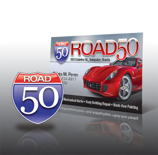
Road 50
 |
| Logo design: Road 50 |
The auto paint & repair shop is owned by business
partners that are aged 50-ish. As was
explained to me, the word Road had a
meaning beyond literal (I get it, old timers… J).
The original idea was to create a logo that has an image or symbol of a car
incorporated in it. I presented 3 comps that neither had a car. And yes, not
even a wheel or a steering wheel. However, I did use a road sign symbol which
they liked and approved.
KantoInk
 |
| Logo design: KantoInk |
The idea for the name was a result of brainstorming with the
tattoo artist, one of his patrons (who happened to be hanging around at the
time), and myself. The artist and I were discussing about creating a name for
the tattoo shop he was planning to put up. He wanted a name that would describe
his roots that local clients can easily relate to, hence, the final logo. The word
Kanto is a local term which means a street
corner combined with the word Ink that
is associated with tattooing.
A small contribution to the design community
24 Jan 2012
 |
| Adobe Photoshop actions by makdesign: created and mostly compatible with Photoshop CS3 or higher. |
 |
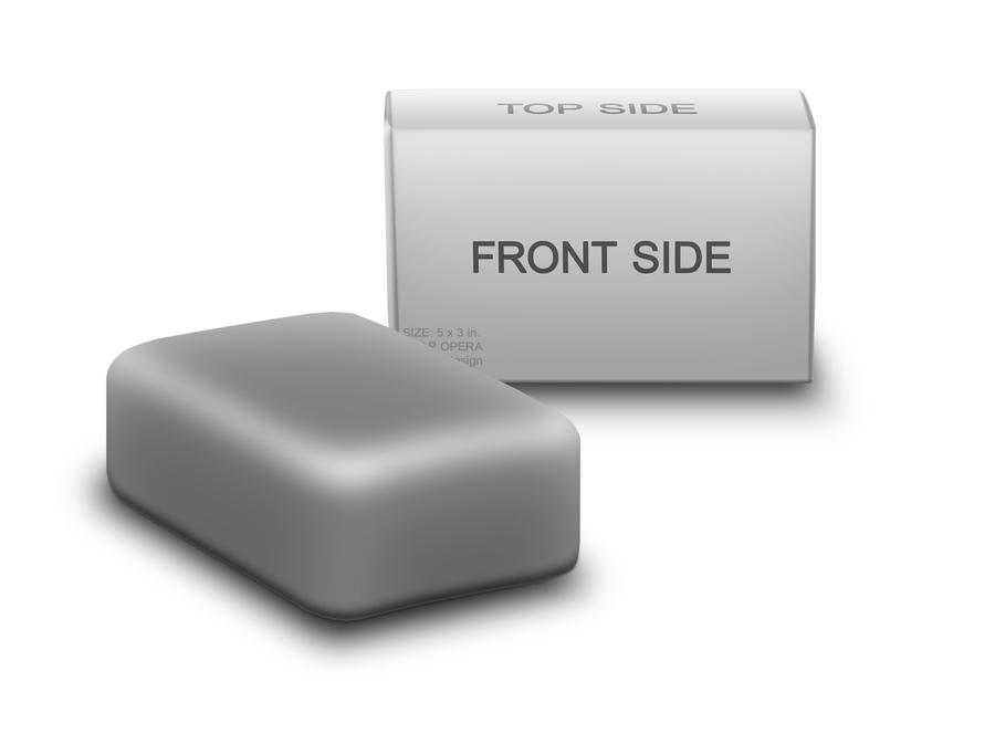
| SoapBox action |
In one of my projects as a freelance graphic designer, I was commissioned to create marketing peripherals for a variety of natural soap products. The client was a small-time business man. He needed a logo, a brochure, product packaging, a MS PowerPoint presentation for seminars, and a website. Since the client was starting from scratch, he didn't have enough resources to provide me with the materials I needed which are, basically, photos of the products itself. So I had no option but to create the product digitally.
 |
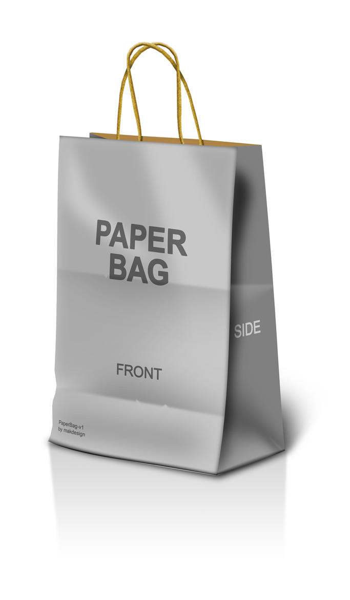
| PaperBag action |
The product had four variants so I needed that same number of photos. It would have been easier if they were created using a 3D application. The only thing is I didn't know how to use one, or at least I didn't know how to use an application that would give me the result I wanted so my only option is to use Adobe Photoshop. Using Photoshop's Action palette I created the set of images.
I've uploaded the actions and made it available for download on my DeviantART.com account. Please feel free to use them for your project. I only ask that you send me an email to let me know you're using it and if you have any question.